When EUR/JPY Bulls Set The Perfect Trap: Spotting Hidden Moves
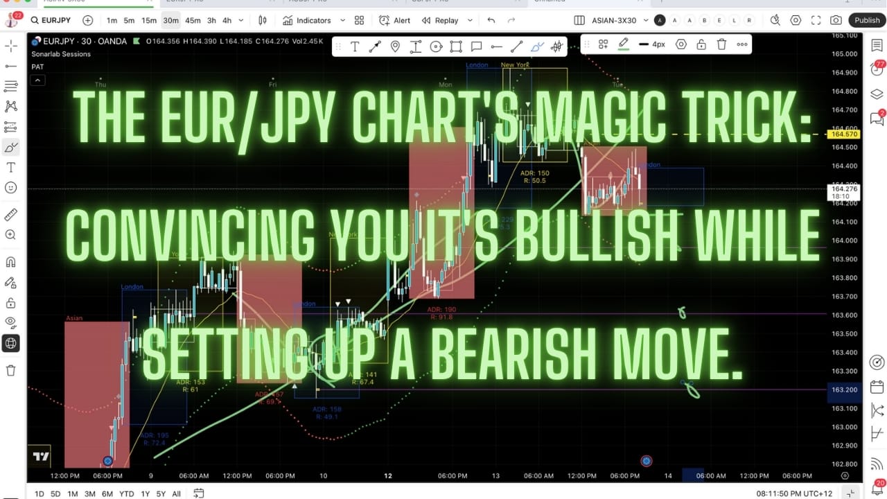
The EUR/JPY chart's greatest magic trick: convincing you it's bullish while setting up a bearish move. That floating zone breakdown? Just the market's way of saying 'surprise!' when you least expect it. Trading irony at its finest."

Morning Check-In
Good morning, everyone. I thought I'd do a quick check-in this morning to share what I'm seeing in the markets today.
Initial Market Observation
What grabbed my attention straight away is the Euro/JPY chart. Let me show you what I'm seeing. I've drawn this line here so we can track the movement more easily.
Looking at the chart, you can see we're trading under this key line, which indicates some weakness in the market. Notice how the price action has come up through the top line but has now dropped through into this lower lane. This pattern is potentially signaling the start of a downward move.
Historical Pattern Example
To give you a clearer idea of what I'm looking for, let me highlight a similar pattern we've seen before. Look at this previous section where the market dropped through this support point. Notice how the price then moved back above the floating zone and continued through. The principle we're watching for now is very similar.
In our current setup, you can see how the price has moved up and down through this area, creating some accumulation. Then the market dropped through this level. Now it's coming back up to this resistance area, which will likely cause some hesitation in the price.
Potential Market Movement
If this resistance holds, we might see the market break down below this level and continue into a more substantial downward move. One important factor to consider, though, is that we're still in an overall uptrend when we zoom out. This broader trend will influence whether we get a full breakdown and continuation to the downside.
Target Areas
If we do get that downward move, I've identified a few potential target areas. We have this purple line here as our first target, then this level here, and finally this lower level here.
15-Minute Timeframe Analysis
Now let's switch over to the 15-minute chart to get a closer view of what's happening. I've transferred the markers across so we can see the same levels on this timeframe. Sorry about some of the markings being a bit awkward - doing this directly in TradingView has its challenges sometimes.
On the 15-minute chart, you can see that the market is currently sitting underneath the dashed line we established earlier. The market came back down and pushed through a bit during this recent session.
30-Minute Timeframe Context
The 30-minute chart gives us a more stable view of the market because it's a longer timeframe. I've brought this green line across to this chart as well. This is what we're watching closely - a clean break below this level would be very interesting indeed.
As I mentioned, we're currently trading below this dashed line, so that's what we're paying attention to at the moment. The market is showing signs that we've tried to move to the downside.
Using The 5-Minute Chart For Entry
I've also opened the 5-minute chart which you can see over here. The reason I have this timeframe ready is for when I get right down to taking an actual trade. When I'm ready to enter the market, I'll look to this 5-minute chart for precise timing.
Let me give you an example of how I'd use this. Let's suppose we decide to take an entry point here, at this breakdown below this level. I'm just using this as an example. If the market was around this level now and I was looking for a breakdown below this point, I'd use the 5-minute chart to fine-tune my entry. This approach also helps me determine where to place my initial stop, which would go just above this level here.
Trade Management Process
So that's why I look at the 5-minute chart at this critical decision point. This whole setup is definitely worth keeping an eye on, especially around this level. After I've identified my entry point on the 5-minute chart, I'd simply go back to my 30-minute chart.
I'd keep my eye on the 30-minute chart, watching and waiting to see what happens. What I'm specifically looking for is if the price starts to move away from this center floating zone and drops further into this lower lane while remaining under the dashed line. That's the scenario I'm watching for right now.
Alternative Scenario
Of course, if that doesn't happen and we instead get a continuation of the overall upward move, then what we'd be looking at is a brief test of the level, a bounce back into the central zone, and then potentially a move back up into the top floating zone. But as I said, the setup I've just walked through is what I'm currently watching and how I'm viewing the market at this moment.
Closing
Hopefully that helps clarify how I'm analyzing this particular setup. Let me know how you apply this in your own trading and what results you get. Keep sending in your Loom videos - the feedback I'm getting is phenomenal, and don't forget that I can help you personally. When you send your Loom videos to me, I'll provide you with detailed personal feedback on your trades.